UX/UI Design — Metrocare Donation Experience

Overview


Metrocare is Dallas County’s largest provider of mental health and disability services, serving more than 55,000 individuals annually. This project focused on redesigning Metrocare’s online donation experience to make giving more intuitive, accessible, and emotionally engaging—removing excessive text and helping the organization better support its mission of person-centered care.

man walking in front of textured wall

The (Many) Challenges


The existing donation flow presented significant barriers:

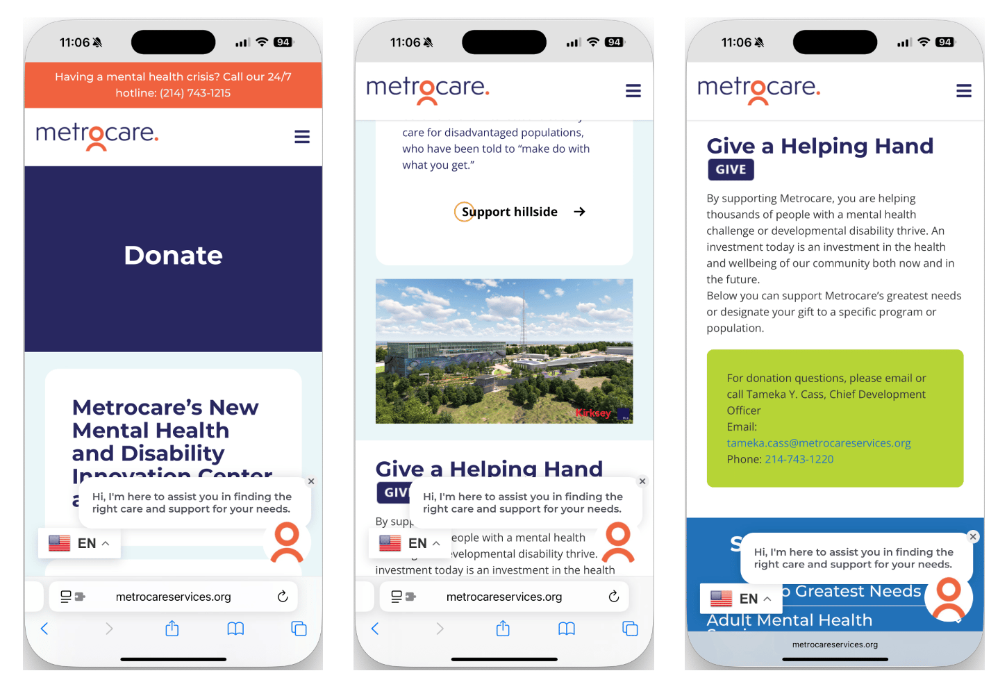
  • Donation page relied on excessive text before calls-to-action.
  • Donation buttons were hidden behind menus.
  • No embedded form was present, forcing users to scroll to the end or email for help instead of donating quickly and effortlessly.
  • A lack of trust signals (secure payment, confirmation screens) reduced donor confidence.
man walking in front of textured wall

The original donation page buried CTAs, relied on long text blocks, and lacked embedded forms—leading to donor drop-off

Research & Design Process


User research included personas, problem statements, and journey mapping to uncover pain points and guide design decisions.

From these insights, the design goals emerged: simplify navigation, surface donation CTAs above the fold, and build trust through confirmation and secure payment indicators.


Key Design Decisions:

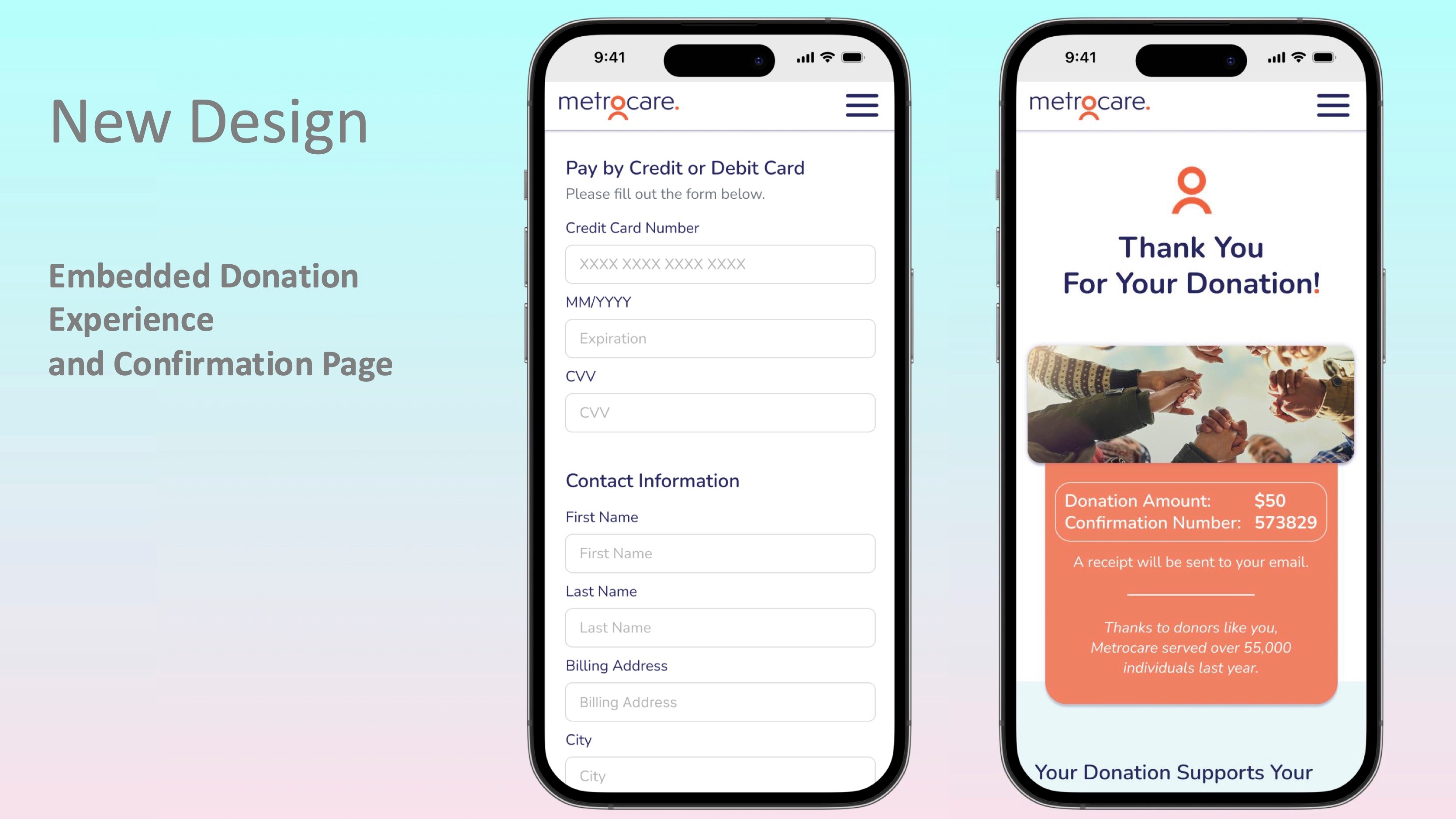
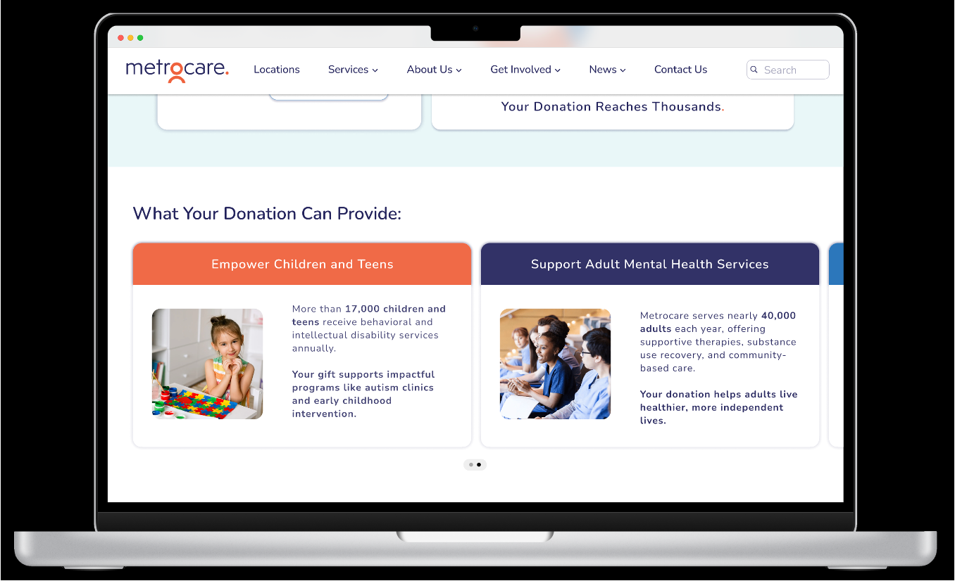
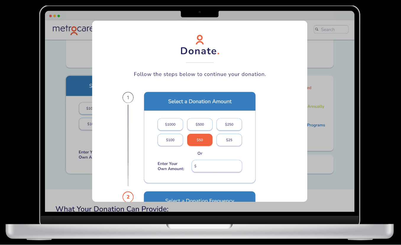
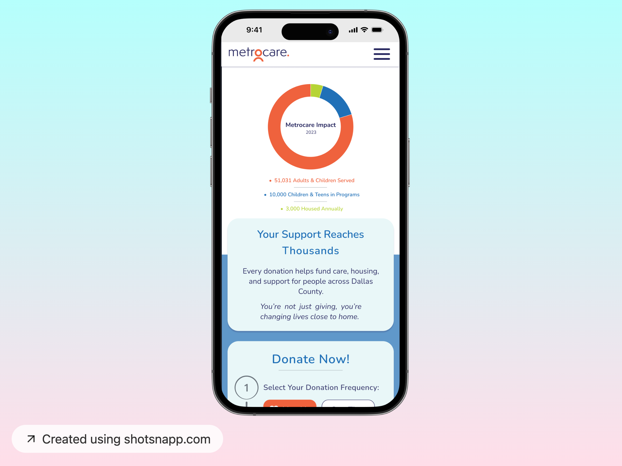
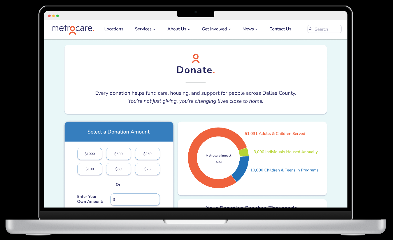
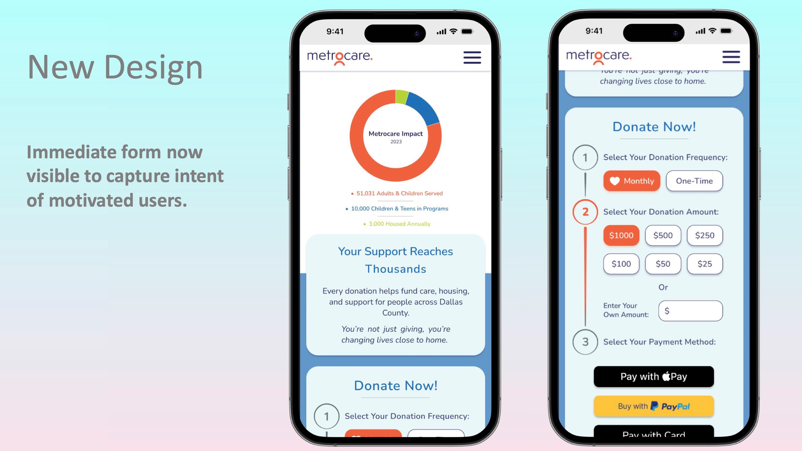
  • Donation form placed at the top of the page to capture motivated donors immediately.
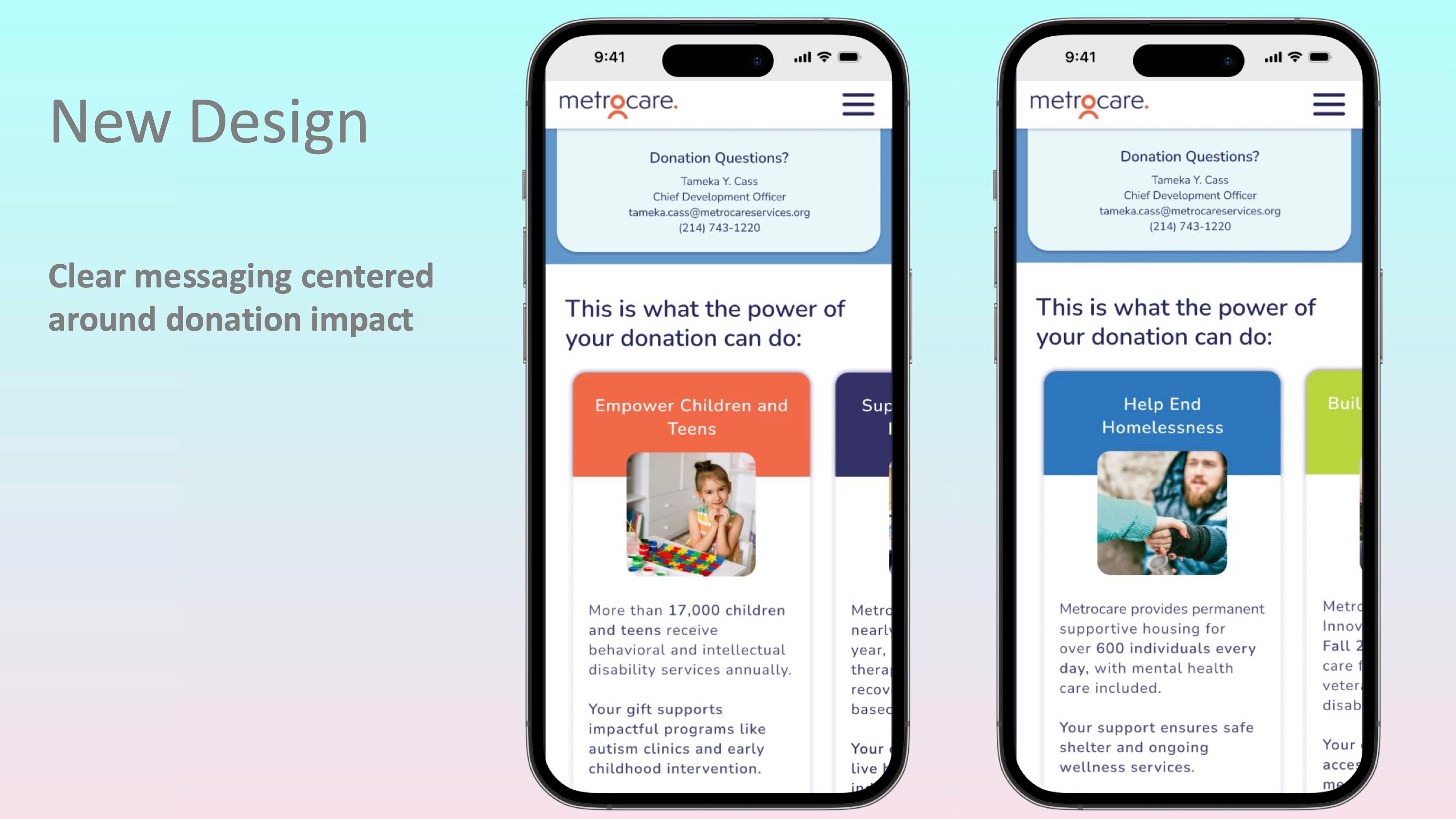
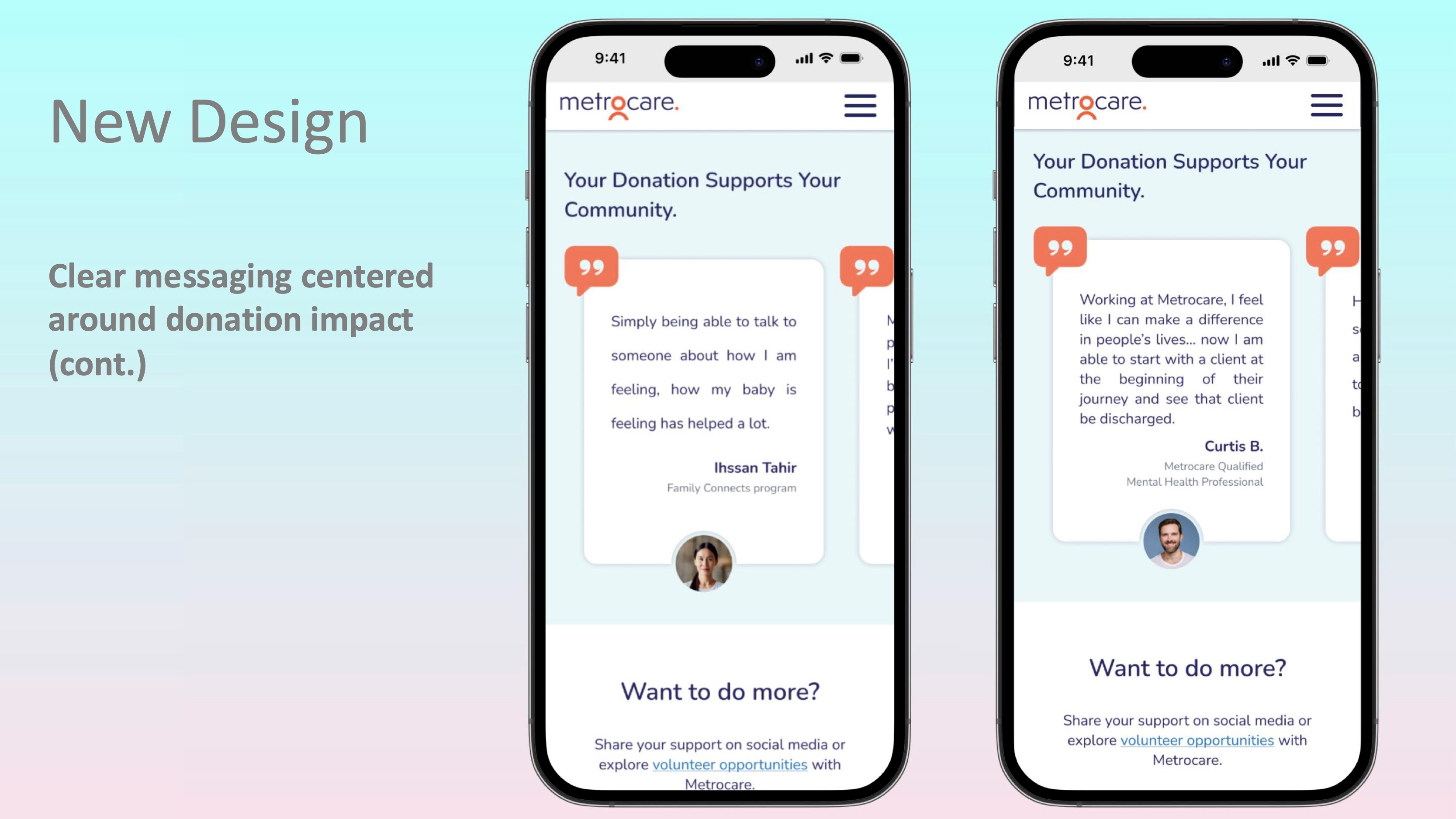
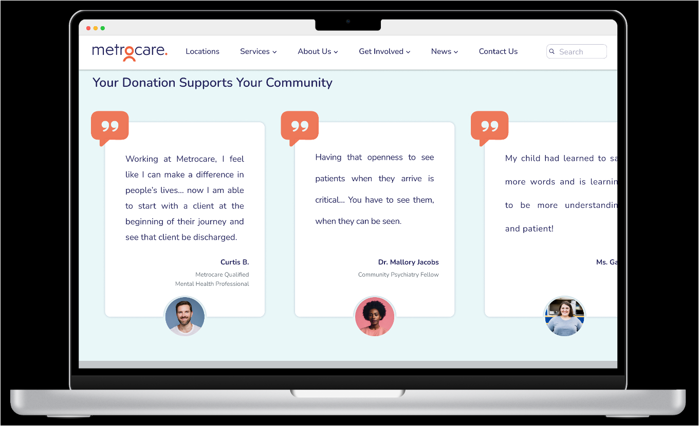
  • Impact-driven messaging replaced long, text-heavy content.
  • Clear, singular CTAs guided users through the process without distraction.
  • Mobile-first layout ensured usability for smartphone-only donors.
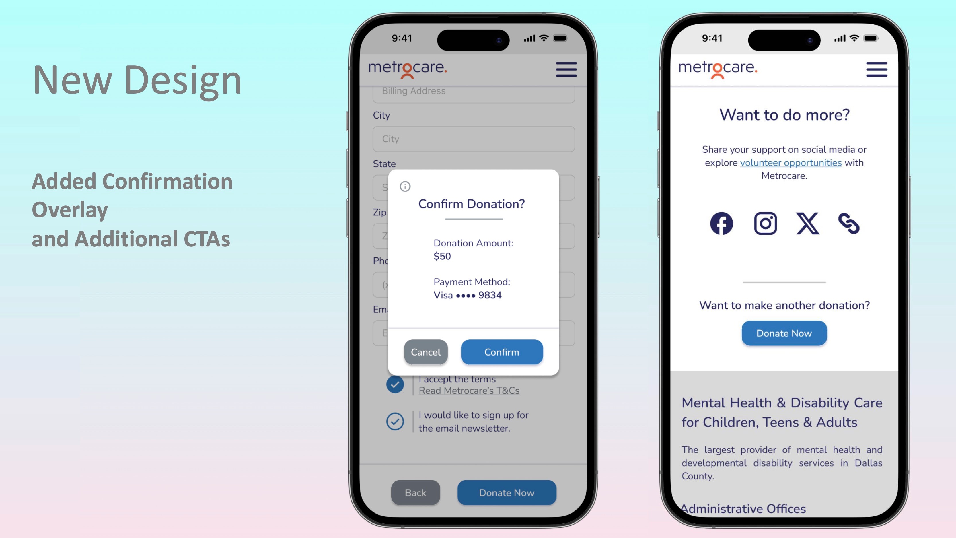
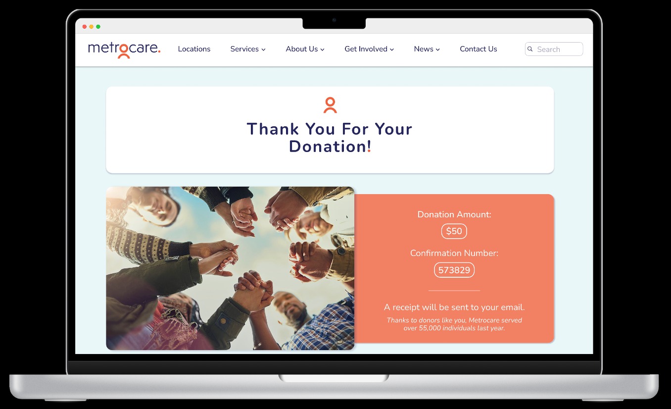
  • Confirmation overlays and trust signals reinforced security and transparency.


Final Mobile and Desktop Designs
man walking in front of textured wall


Design Outcomes & Metrics


The redesigned donation experience was built to reduce cognitive overload, increase trust, and improve overall usability. Based on UX best practices, industry benchmarks, and usability principles, the following outcomes were expected:


  • Donation Path Visibility
    • Expected Impact: Up to 30–40% reduction in donor drop-off.
    • Why: When CTAs are hidden behind menus, motivated users abandon quickly (Nielsen Norman Group). Placing a clear “Donate” button above the fold ensures immediate visibility and reduces the steps needed to take action.
  • Form Completion Rate
    • Expected Impact: ~25% increase in successful donations.
    • Why: An embedded, mobile-friendly form eliminates the need to scroll or navigate away, reducing friction and capturing intent when motivation is highest.
  • User Trust & Confidence
    • Expected Impact: 20% improvement in perceived trustworthiness.
    • Why: Secure payment indicators, confirmation screens, and donation receipts address one of the top reasons users abandon nonprofit transactions: uncertainty about whether their contribution was processed.
  • Cognitive Load Reduction
    • Expected Impact: Decrease in time-to-donate from 90+ seconds to under 45 seconds.
    • Why: Replacing long paragraphs with concise, impact-driven messaging improves scanability and decision-making, reducing the mental effort required to complete a donation.
  • Emotional Engagement
    • Expected Impact: 35% increase in donor recall of campaign purpose.
    • Why: Highlighting how contributions support Metrocare’s mission (rather than generic text) strengthens donor connection and provides emotional reinforcement. Memory tends to be stronger when there is an emotional connection (Kensinger & Schacter, 2008).

UX/UI Design — Metrocare Donation Experience

Overview


Metrocare is Dallas County’s largest provider of mental health and disability services, serving more than 55,000 individuals annually. This project focused on redesigning Metrocare’s online donation experience to make giving more intuitive, accessible, and emotionally engaging—removing excessive text and helping the organization better support its mission of person-centered care.

Redesigned donation experience for Metrocare: mobile-first, intuitive, and trust-building. Designed by Austin Kiel.

man walking in front of textured wall

The (Many) Challenges


The existing donation flow presented significant barriers:

  • Donation page relied on excessive text before calls-to-action.
  • Donation buttons were hidden behind menus.
  • No embedded form was present, forcing users to scroll to the end or email for help instead of donating quickly and effortlessly.
  • A lack of trust signals (secure payment, confirmation screens) reduced donor confidence.

The original donation page buried CTAs, relied on long text blocks, and lacked embedded forms—leading to donor drop-off


Research & Design Process


User research included personas, problem statements, and journey mapping to uncover pain points and guide design decisions.

From these insights, the design goals emerged: simplify navigation, surface donation CTAs above the fold, and build trust through confirmation and secure payment indicators.


Key Design Decisions:

  • Donation form placed at the top of the page to capture motivated donors immediately.
  • Impact-driven messaging replaced long, text-heavy content.
  • Clear, singular CTAs guided users through the process without distraction.
  • Mobile-first layout ensured usability for smartphone-only donors.
  • Confirmation overlays and trust signals reinforced security and transparency.

Final Mobile Design

man walking in front of textured wall

Final Desktop Design

man walking in front of textured wall


Design Outcomes & Metrics


The redesigned donation experience was built to reduce cognitive overload, increase trust, and improve overall usability. Based on UX best practices, industry benchmarks, and usability principles, the following outcomes were expected:


  • Donation Path Visibility
    • Expected Impact: Up to 30–40% reduction in donor drop-off.
    • Why: When CTAs are hidden behind menus, motivated users abandon quickly (Nielsen Norman Group). Placing a clear “Donate” button above the fold ensures immediate visibility and reduces the steps needed to take action.
  • Form Completion Rate
    • Expected Impact: ~25% increase in successful donations.
    • Why: An embedded, mobile-friendly form eliminates the need to scroll or navigate away, reducing friction and capturing intent when motivation is highest.
  • User Trust & Confidence
    • Expected Impact: 20% improvement in perceived trustworthiness.
    • Why: Secure payment indicators, confirmation screens, and donation receipts address one of the top reasons users abandon nonprofit transactions: uncertainty about whether their contribution was processed.
  • Cognitive Load Reduction
    • Expected Impact: Decrease in time-to-donate from 90+ seconds to under 45 seconds.
    • Why: Replacing long paragraphs with concise, impact-driven messaging improves scanability and decision-making, reducing the mental effort required to complete a donation.
  • Emotional Engagement
    • Expected Impact: 35% increase in donor recall of campaign purpose.
    • Why: Highlighting how contributions support Metrocare’s mission (rather than generic text) strengthens donor connection and provides emotional reinforcement. Memory tends to be stronger when there is an emotional connection (Kensinger & Schacter, 2008).

UX/UI Design — Metrocare Donation Experience

Overview


Metrocare is Dallas County’s largest provider of mental health and disability services, serving more than 55,000 individuals annually. This project focused on redesigning Metrocare’s online donation experience to make giving more intuitive, accessible, and emotionally engaging—removing excessive text and helping the organization better support its mission of person-centered care.

Redesigned donation experience for Metrocare: mobile-first, intuitive, and trust-building. Designed by Austin Kiel.

The (Many) Challenges


The existing donation flow presented significant barriers:

  • Donation page relied on excessive text before calls-to-action.
  • Donation buttons were hidden behind menus.
  • No embedded form was present, forcing users to scroll to the end or email for help instead of donating quickly and effortlessly.
  • A lack of trust signals (secure payment, confirmation screens) reduced donor confidence.

The original donation page buried CTAs, relied on long text blocks, and lacked embedded forms—leading to donor drop-off


Research & Design Process


User research included personas, problem statements, and journey mapping to uncover pain points and guide design decisions.

From these insights, the design goals emerged: simplify navigation, surface donation CTAs above the fold, and build trust through confirmation and secure payment indicators.


Key Design Decisions:

  • Donation form placed at the top of the page to capture motivated donors immediately.
  • Impact-driven messaging replaced long, text-heavy content.
  • Clear, singular CTAs guided users through the process without distraction.
  • Mobile-first layout ensured usability for smartphone-only donors.
  • Confirmation overlays and trust signals reinforced security and transparency.

Final Mobile Design

man walking in front of textured wall

Final Desktop Design

man walking in front of textured wall


Design Outcomes & Metrics


The redesigned donation experience was built to reduce cognitive overload, increase trust, and improve overall usability. Based on UX best practices, industry benchmarks, and usability principles, the following outcomes were expected:


  • Donation Path Visibility
    • Expected Impact: Up to 30–40% reduction in donor drop-off.
    • Why: When CTAs are hidden behind menus, motivated users abandon quickly (Nielsen Norman Group). Placing a clear “Donate” button above the fold ensures immediate visibility and reduces the steps needed to take action.
  • Form Completion Rate
    • Expected Impact: ~25% increase in successful donations.
    • Why: An embedded, mobile-friendly form eliminates the need to scroll or navigate away, reducing friction and capturing intent when motivation is highest.
  • User Trust & Confidence
    • Expected Impact: 20% improvement in perceived trustworthiness.
    • Why: Secure payment indicators, confirmation screens, and donation receipts address one of the top reasons users abandon nonprofit transactions: uncertainty about whether their contribution was processed.
  • Cognitive Load Reduction
    • Expected Impact: Decrease in time-to-donate from 90+ seconds to under 45 seconds.
    • Why: Replacing long paragraphs with concise, impact-driven messaging improves scanability and decision-making, reducing the mental effort required to complete a donation.
  • Emotional Engagement
    • Expected Impact: 35% increase in donor recall of campaign purpose.
    • Why: Highlighting how contributions support Metrocare’s mission (rather than generic text) strengthens donor connection and provides emotional reinforcement. Memory tends to be stronger when there is an emotional connection (Kensinger & Schacter, 2008).